Table of Content, LO1
- Tutorial Game Godot
- Portfolio Godot Game
- Research, Prototype, and Produce for My Portfolio
- Belco Alliance UX/UI
- Belco Education Website
Tutorial Game Godot
Introduction
After completing the first assessment, I wanted to pursue something I truly cared about: game development. Since I plan to study game development further, I researched engines with WebGL support and found Godot to be both accessible and browser-friendly. To start learning, I followed a YouTube tutorial by Brackeys to get familiar with Godot’s workflow and interface.
To get started, I needed to learn the basics: navigating the interface and understanding essential shortcuts. I found a , which helped me build my first game.
Process
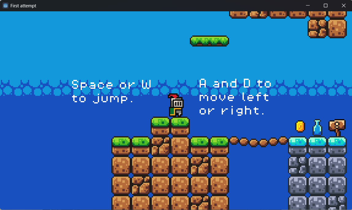
- Followed Brackeys’ tutorial to build a simple platformer using Godot’s built-in player movement — this was the most beginner-friendly way to explore the engine.
- Used sprite sheets and tilesets to create the level visually and added collisions to prevent the player from falling through or walking off.
- Added a kill zone to reset the player if they fell, creating basic game logic.
- Created a moving enemy using raycasting so that it could patrol a platform.
- Implemented a coin system using variables to track how many coins were collected.
- Added background music and sound effects using the AnimationPlayer and scene nodes accordingly.
Validation
Two teachers play-tested the tutorial game. They were satisfied with the technical execution but recommended I plan how the Learning Outcomes (LOs) would be presented within the game — suggesting that I provide the LOs in PDF format for now.
They also advised studying existing games more critically, using classics like Super Mario as reference for design concepts (e.g., weighted jumps and player feedback).
Takeaway
- Tutorials were helpful but outdated — some steps were overly complicated due to old Godot practices.
- Feedback helped redirect my thinking toward the purpose of the game — to present learning outcomes clearly, not just make a demo game.
- The tutorial gave me a solid foundation in Godot's basics, but didn’t address user experience, which became a core focus later.
Reflection
This early experience taught me how valuable up-to-date resources are and how important it is to think critically about tutorials. I also discovered that tile mapping wasn’t enjoyable for me, so I’ll consider alternative level design approaches in the future. I began to see that even technical demos need a clear goal and that playability should always align with the intended user experience.
Portfolio Game Godot
Introduction
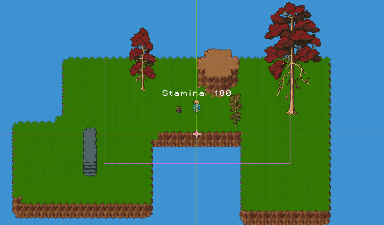
After completing the tutorial game, I began work on a top-down 2D portfolio game that would showcase both my development capabilities and the Learning Outcomes themselves. My goal was to make a game that was not only functional but also personal and expressive — one that integrated assessment content into the gameplay through world interaction.
Process
- Selected and imported asset bundle from itch.io — it provided a wide range of top-down assets, matched the aesthetic I was aiming for, and was cost-effective for use in both this and future projects.
- Created top-down player movement — adapted input logic from the tutorial but reworked it to support full directional movement, which was more appropriate for the perspective I wanted.
- Added sprint functionality — this made movement feel smoother and more responsive, and introduced an interactive mechanic beyond basic walking.
- Set up a tilemap system using a cleaner layering method than in the tutorial — made level design easier to test, though I still found tilemapping tedious.
- Began implementing a basic enemy AI — primarily to experiment with animation and logic, though this feature was ultimately unused.
- Sketched out and implemented interaction systems — planning how the player would interact with bookshelves to access Learning Outcomes, turning in-game objects into interactive, informative elements.
- Started the Book UI system — designed to open when interacting with bookshelves, formatted using RichTextLabels and BBCode to display styled text and images across multiple pages.
Validation
Students and Teachers provided feedback during development and after play-testing:
- I focused too much on unused mechanics (like enemy AI), which took time away from more important features like Learning Outcomes.
- They reminded me to think about scope and to prioritize the core message of the project over technical ambition.
- To be user-friendly by providing instructions at the beginning and prompts for hidden mechanics such as a zoom-in
- Found bugs that would hinder the flow of the game
Takeaway
- Over-scoping hurts progress. I learned that cool features are irrelevant if they don't serve the project's purpose.
- Prioritization and scoping are essential when working with deadlines and expectations.
Reflection
I learned that lack of concepting, planning, and iteration can slow a project down and leave important features underdeveloped. My early focus on less important systems cost me time. I now understand that prototyping first, even on paper or in Figma, helps prevent wasted effort and keeps the project aligned with its goals.
That lesson carried into my current work — a new HTML-based version of the project — which I properly planned, concept, and iterated. This pivot is a direct result of the reflection and feedback from the portfolio game.
Research, Prototype for My Portfolio
Introduction
With time running out, I decided to shift from developing a Godot-based portfolio game to creating a web-based interactive portfolio using HTML, CSS, and JavaScript. I wanted to apply everything I had learned — research, feedback integration, prototyping — to build something structured, flexible, and more achievable in the timeframe. The goal remained the same: to present my Learning Outcomes in a creative way.
Process
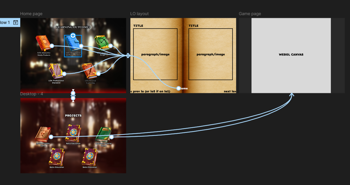
- I chose the library aesthetic with clickable books, inspired by an example student portfolio shown during presentations from teachers and to stay on topic with my portfolio game.
- Sourced assets and prototyped a home page with animated video background using CSS-only methods.
- I researched redirect methods from Godot to the browser (using JavaScript via GDScript export) in case I still wanted in-game access to the site.
- Designed a scrollable “book page” mechanic for showing LO content with embedded text.
- User feedback produced better visual results and readability, while maintaining the book UI layout I had for the game.
Validation
I went twice to Dirk to validate my work, after user-testing my hight-fidelity prototype:
- First round, requested clearer visual structure and using learning outcomes instead of a placeholder to see how the structure would work.
- Second round, mentioned the spacing between text was too close and the size was too similar which did not display the hierarchy.
Takeaway
- Prototyping first speeds up development and improves design decisions.
- Early feedback avoids wasted effort later, something I needed to focus on during the portfolio game.
- Treating a portfolio like a product results in a better user experience.
Reflection
This portfolio design process finally brought together everything I’d learned across multiple projects. Instead of chasing complexity, I focused on clarity, usability, and iteration. It’s a better representation of my skills and how I approach interactive media.
Belco Alliance UX/UI
Introduction
The goal of the UX/UI phase of the Belco project was to redesign a non-profit organization's outdated website by applying user-centered design principles. Our group collaborated to create interactive prototypes based on client feedback and target audience research.
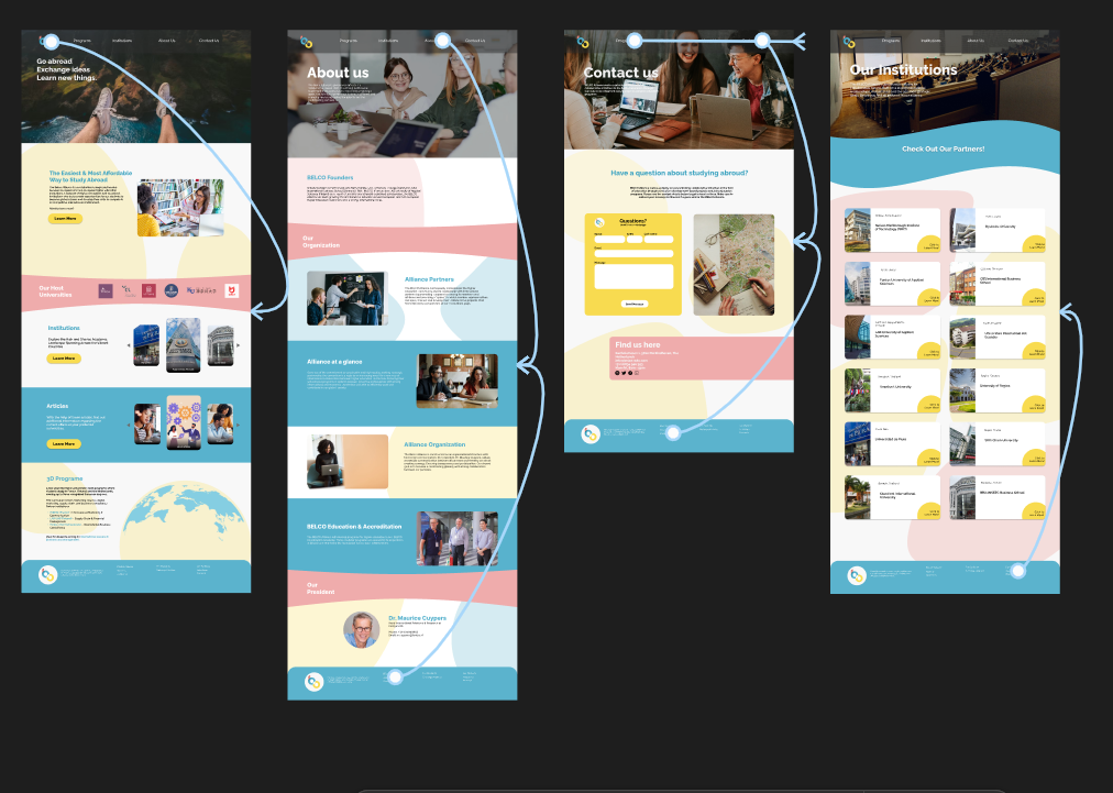
Process
- I conducted competitive design research, analyzing similar non-profit websites to gather inspiration and highlight what Belco lacked.
- We divided responsibilities; I created iterations for the “About” and “Program” pages using Figma.
- Each iteration was discussed and adjusted based on group and teacher feedback.
- I redesigned elements to add hierarchy and visual consistency, including stylized backgrounds and symmetrical layouts for balance.
Why?
The purpose was to create a well-researched, intuitive, and appealing user interface, replacing the outdated site. Creating modular pages and iterating allowed the designs to be more tailored to the needs of Belco’s users.
Validation
Dirk conducted user testing by role-playing multiple types of users interacting with the Belco Alliance prototype. One of these user roles, “Brock,” surfaced several issues:
- Inconsistent design between pages harmed the user experience.
- Broken navigation links (e.g., the student page) interfered with usability.
- Confusing layout and navigation made the site difficult to use intuitively.
Takeaway
- Creating an asset page will reduce the risk of inconsistencies between pages.
- broken navigation, even in a prototype, can immediately disrupt credibility and distract from user testing.
- Dirk’s approach of testing as multiple user types revealed how specific audiences are difficult to deal with and should be adapted when doing another user-test
Reflection
This project emphasized the importance of planning and research before designing. Collaborative iteration and diverse feedback significantly improve the final result. I also learned the importance of integrating both client and user needs into the design process.
Belco Education Website
Introduction
After finalizing the designs, the next step was converting our Figma prototype into a fully functioning website using HTML, CSS, and JavaScript. The aim was to ensure accessibility, responsiveness, and adherence to the intended design.
Process
- I developed the Institutions and Program pages using a rem-based layout for responsiveness.
- We used a global CSS file for consistent styles and separate files for each page to avoid conflicts.
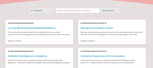
- I implemented a JavaScript-based filtering system for the Programs page.
- Code was commented and organized for clarity and future edits.
- At the end, the site was validated through teacher and student testing.
Why?
Turning the design into an actual website meant making it work on every screen and making sure each part was connected and clickable. We used a shared style file to keep things looking the same across pages, and gave each page its own CSS to avoid messing up someone else’s work. JavaScript made parts of the site more user-friendly, like helping users filter programs or navigate faster.
Validation
We had students that fit the target audience and teachers user-test the website and gave Belco’s president, Maurice, a presentation on the website, the feedback received:
- Minor issues with the text margins but overall it was well received.
- We kept a minimalistic aesthetic of the Belco website while implementing the soft colored background shapes.
- Scaling issues when viewed through different screen sizes.
Takeaway
- User-testing revealed key issues that were not visible during development.
- Responsive design and accessibility considerations became more prominent after user feedback.