Table of Content, LO3
- User Testing and Iteration on the Portfolio Game
- Osfast’s Brand Book
- Belco Alliance Figma
- Portfolio Website
User Testing and Iteration on the Portfolio Game
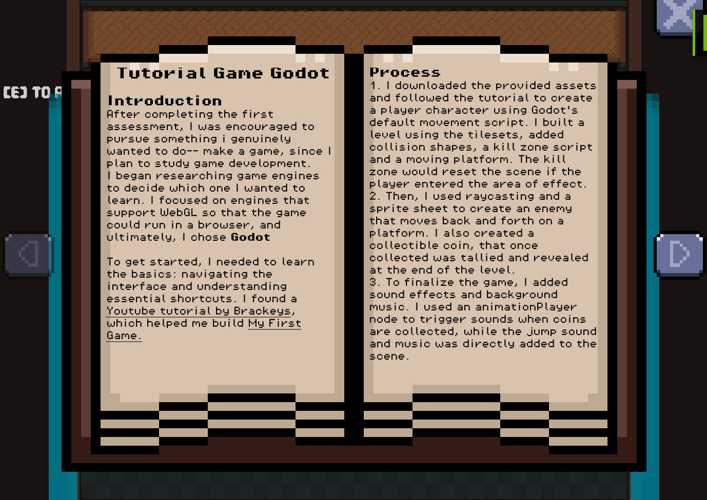
Introduction
As I progressed through the development of my portfolio game, I aimed to make the experience more user-friendly. This required feedback from my target audience and applying iterative improvements based on testing sessions.
How?
The game featured an interactive book mechanic where players could view learning outcomes. It started with a startup animation and books that opened individually. I sent the first draft of the website to be tested by fellow students and that uncovered bugs such as:
- Multiple books could be opened simultaneously, overlapping with each other and breaking the UI.
- Players could interrupt the start-up animation, causing the book to close prematurely and skip important content.
Iteration
- Added a global boolean to ensure only one book can be opened at a time.
- Disabled player input during the start-up animation to prevent accidental interactions.
- Cleaned up interaction logic across all book-related elements to respect these new conditions.
Validation
Dirk reviewed the updated version and gave feedback:
- The previous issues were resolved — books no longer opened multiple times, and the intro played without interruption.
- Lack of instructions — players didn’t know the controls or what the game expected of them.
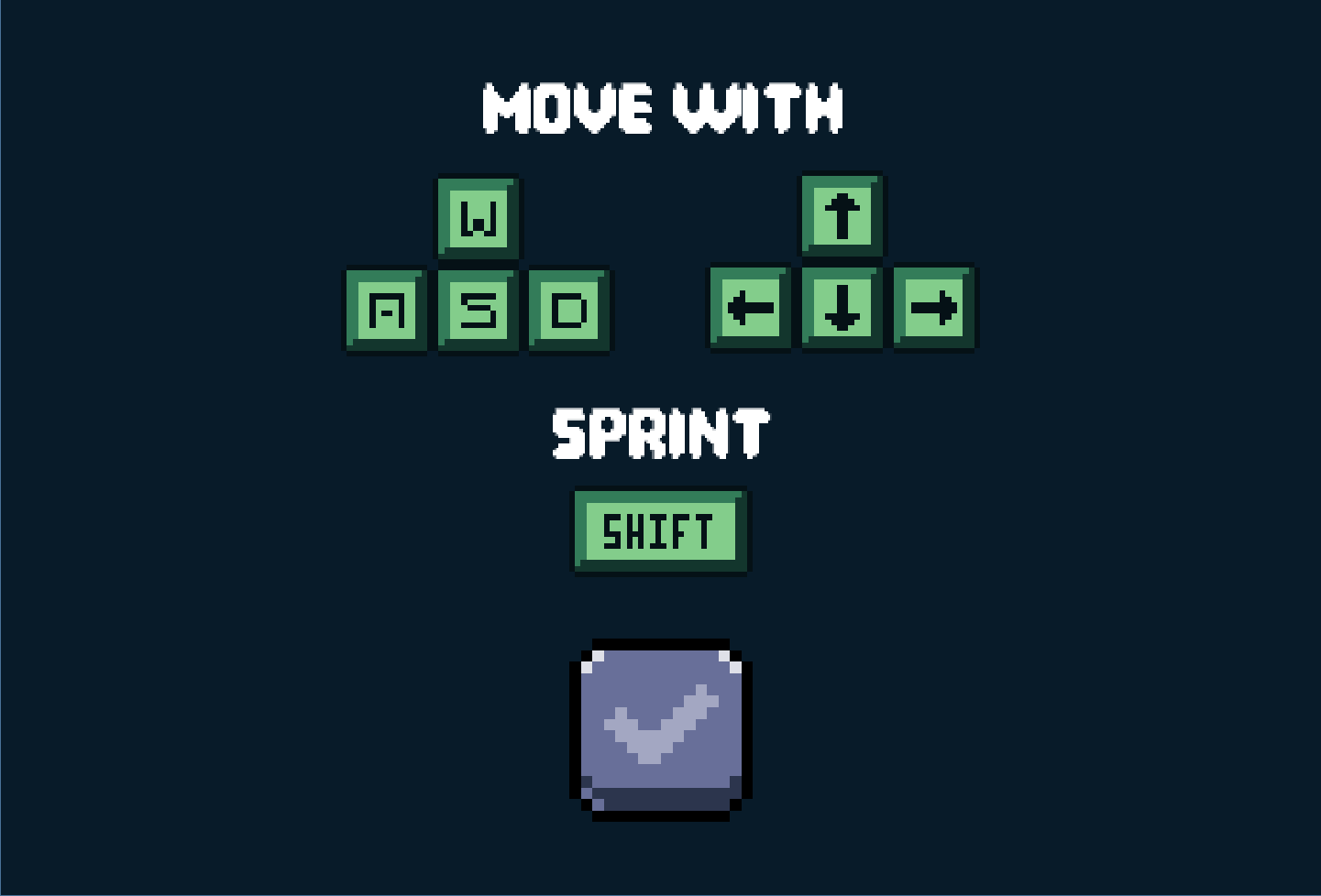
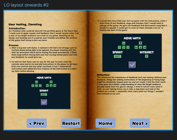
Iteration
Designed a start-up instructions menu that appears before gameplay: explained core controls like movement and sprint. To instruct users of the controls of the game.
Final Validation
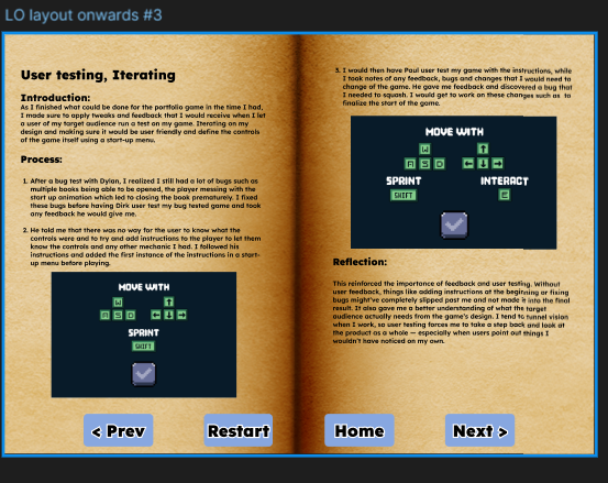
Paul user-tested the new updated iteration, implemented with Dirk's feedback, his feedback:
- The instructions screen helped a lot — he understood the control
- However I still had a repetitive prompt that constantly started with “press [e] to…”
- One small interaction bug was found during this test, users that used the keyboard input could continue flipping pages while the image was zoomed in.
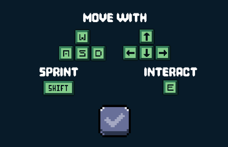
Iteration
- Removed the "[e] to..." prompt and placed the instructions to interact in the start up menu.
- Added a boolean to restrict player keyboard input when an image is zoomed.
Validation
I returned with the updated iteration to Paul, and the issues were resolved with no more issues arising
Reflection
This process highlighted the critical importance of multiple validation rounds. Each revealed insights I wouldn’t have caught alone. Iterating between rounds gave space to fix bugs and refine the user experience. Without external feedback, oversights like confusing prompts or animation bugs would have stayed in the final product.
Osfast’s Brand Book
Introduction
For our first group project, we were assigned to work with a real client: Oscar from “Osfast.” After a short presentation about his work, Oscar provided a brand overview, slides, and a link to his current website. From there, our group began gathering data and discussing how to visually strengthen his brand identity. Oscar was open to questions and allowed us to explore potential improvements based on our own research and expertise.

How?
After our first sprint and discussion with the client, we developed a brand guide outlining logo usage, color palette, and visual identity. The first draft was colorful and vibrant using the brand color palette.
After completing the first draft of the Osfast brand guide, I reviewed it with Fahri and brought it to Chris, our design expert, for feedback:
- The color palette was too vibrant, making the layout hard on the eyes.
- The overall balance in design needed refinement, particularly in contrast, emphasis, and whitespace.
- He introduced us to the 60/30/10 rule — a standard design principle to balance dominant, secondary, and accent colors in a composition.

Iteration
- Applied the 60-30-10% rule to the brand-guide:
- Reduced the saturation and coverage of accent colors
- Made sure to only apply the highlights around 10% of the brand guide
- Adjusted layout spacing and content alignment to improve readability and visual hierarchy
- Reviewed and edited the document to be cleaner, calmer, and easier to read.
Validation
We returned back to Chris after applying the changes and the rule, he complimented how much easier and less strain there was on the eyes. Thus it was approved.
reflection
I learned that feedback from a non-client expert is valuable — Oscar liked the original version, but he wasn’t the target audience. This emphasized the role of design rules and external perspective in brand work. In future branding work, I’ll involve multiple layers of feedback before finalizing.
Belco Alliance Figma
Introduction
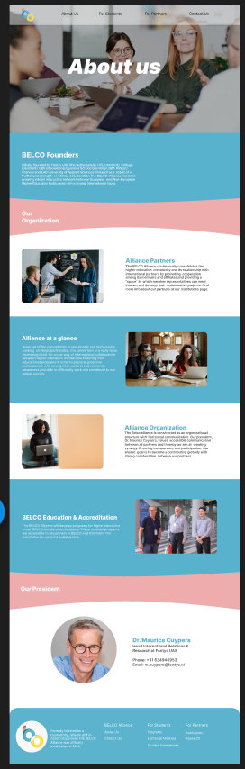
After gathering research data, and user feedback on some concept designs that we would follow, I would be tasked by tackling the about us and program pages for the Belco Alliance prototype. I aimed for consistency within the group’s designs while improving the overall layout through group feedback.
How?
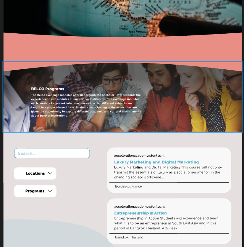
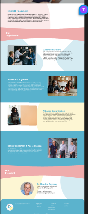
- About us page: Color-blocked sections with minimal styling. Initially excluded the organization’s president and contact details.
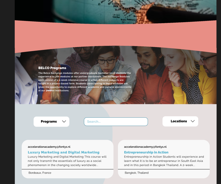
- Programs page: Initially following Belco’s original design layout with a left sidebar filter, single column program display and soft background colors
- Scaling and positioning of the colored section in the about us page, to provide a bigger margin and spacing between the text and images to not be close to the edges of the page.
- The pages were bland with the only color provided is the sectioned blocks.
- The main issue with the program page was the exchange card’s margins.
Iteration
- Edited scaling and positioning based on feedback.
- Added soft color background shapes to the about us and exchange page and changed certain colored sections of the about us page to reduce the amount of color on screen at once.
- The Programs page was changed to be symmetrical with 2 columns and top bar filtering. To give a sense of balance and symmetry to the exchange webpage.
validation
I would show the work I did back to my group-mates and would receive feedback on:
- Minor inconsistency such as font-style and sizes
- Other than that both of the pages were approved.
reflection
This process taught me the importance of structured iteration based on focused feedback. I also realized how valuable external perspectives could be. While group feedback helped shape the core design, getting input from outside the team would have expanded our view of the target audience’s needs. If I were to redo the project, I’d advocate for earlier external validation — particularly from users unfamiliar with the project — to help guide layout decisions more effectively and appeal to the target audience.
Portfolio Website
Introduction
Realizing my portfolio game couldn’t be finished in time, I pivoted to making a well-planned portfolio website. Unlike past efforts, I decided to research and prototype it first and validate each stage with feedback from Dirk.
How?
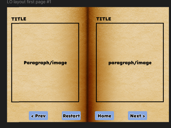
- Designed a library-themed homepage with books representing Learning Outcomes.
- Used scroll-based text updates inside books and CSS video backgrounds.
- Inspired by earlier portfolios shown in class interaction.
- Use actual content for the book page to get a better idea than a placeholder
- To consider if I would like to use a blend filter for images in the book to have the page’s look.
iteration
- Used LO content in the book to give a better look at the final design and structure of the book
- Used the blend filter: hard-light blend the image with the background following the aesthetic of the book.
validation
Dirk approved of the changes done but has brought up more feedback:
- To have better separations between headings and paragraphs for readability
- Make headings larger to have a clear hierarchy
- for the projects section, to have a little mid-page before accessing the website, reduce confusion on users.
iteration
- Added spacing between headings and paragraph for better readability
- Enlarged headings to have a distinct between them and provide a clearer hierarchy
- I also followed the design of the book to create a mid-section before accessing the project to briefly touch up on it.
final validation
To validate my work I would have Chris go through my designs, he approved of the changes that were made following Dirk's feedback.
reflection
This project let me apply all previous lessons in design, iteration, and feedback handling. Instead of rushing through like I did with the game, I researched, planned, and iterated early — and the result is significantly better structured.